Hi! I’m a UX Designer based in New York City. I focus on using empathy to create an equitable experience for all users. Thanks for visiting!
Bakery App
Overview
As part of my certification in UX Design, I designed an app for a fictional bakery. The bakery needed an app to facilitate ordering, therefore saving customers valuable time.
The problem
The bakery often has a long line and some customers need to make their purchases in a hurry.
The goal
Create an app that will let users order products ahead of time and schedule pick up for a convenient time. This will help customers by having their orders ready for pick up as soon as they walk in the door.
My role
I led the design of this fictional scenario. I began with user research and saw the project through to creating a high fidelity prototype.
Responsibilities
User research, empathy mapping, creating personas, user journeys, competitive audit, problem statement, wireframing, prototyping
Research
The first step in designing the bakery app was conducting research on the consumers. I wrote interview questions to find out more about the customers and how they interact with the bakery. Then I analyzed bios of fictional consumers to understand what customers felt when ordering from the bakery and what frustrations they encountered.

2. Define
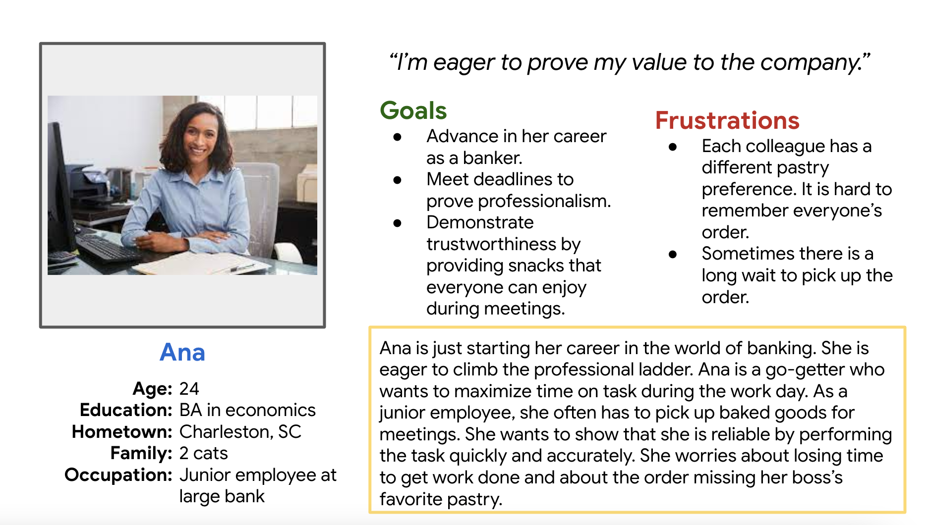
Personas
I used insights from the research to create user personas that represented common themes from the data.
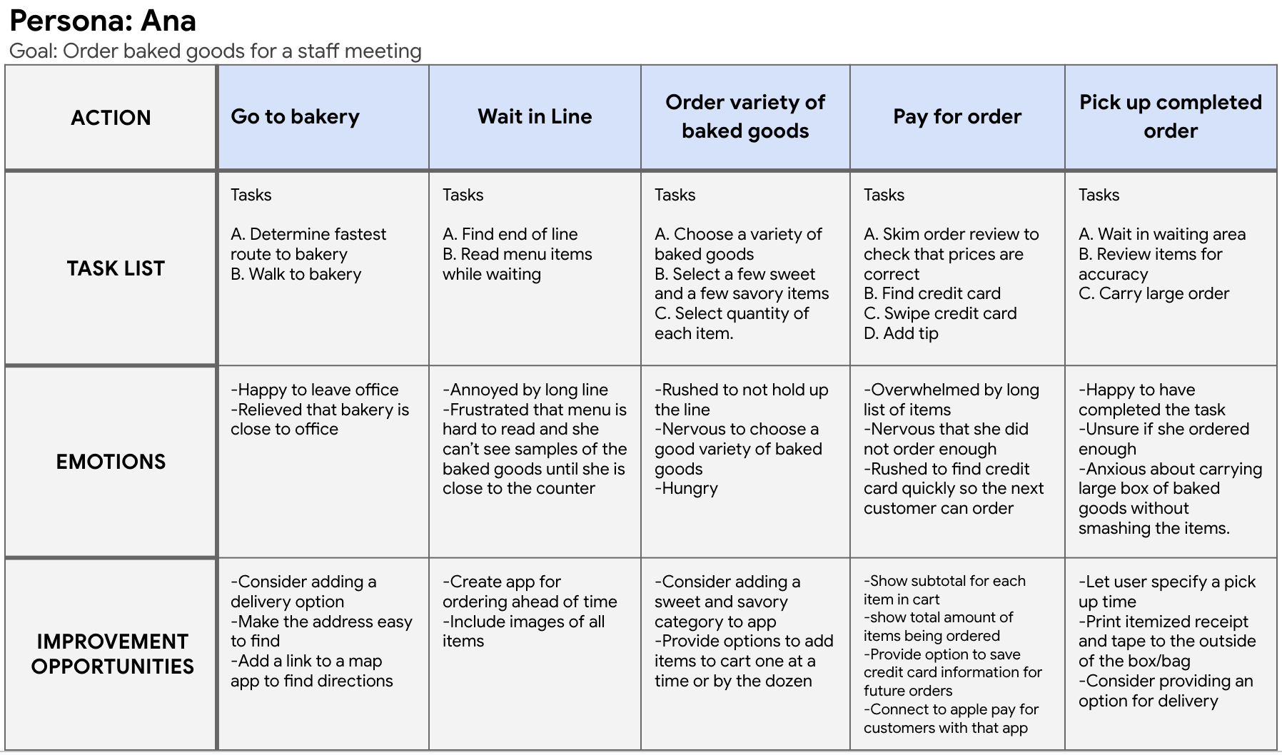
User journey
I put myself in the persona’s shoes by outlining the steps she takes to order from the bakery and the emotions she might experience along the way.
Problem Statement
From here, I wrote a problem statement to clarify the users’ needs that should be addressed in the app.
"Ana is a young professional who needs to order baked goods and pick them up quickly because she wants to maximize time in the office to advance her career."
3. Ideate
Competitive Audit
I completed a competitive audit of direct and indirect competitors of the bakery to get a sense of the strengths and weaknesses of their online ordering experience.
Ideation
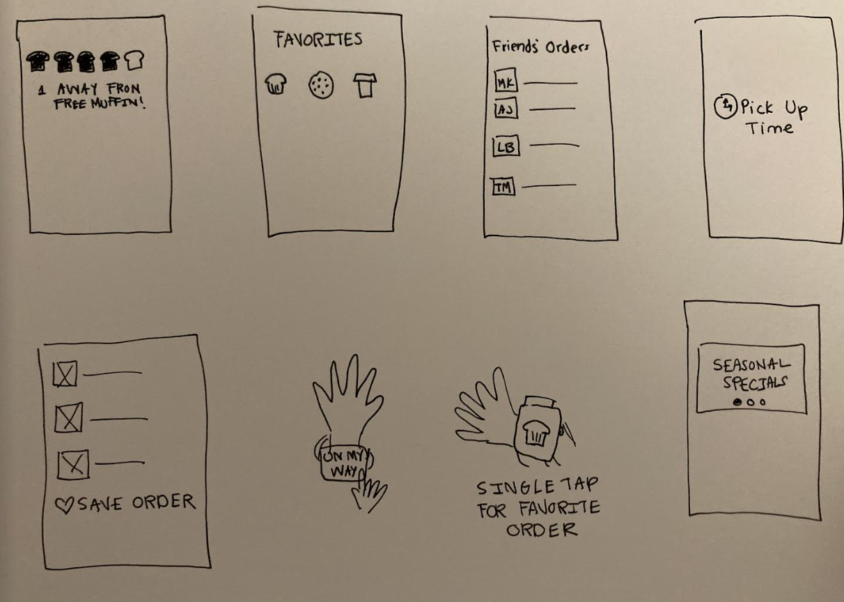
Next, I used crazy eights to brainstorm ideas to include in the app.
Storyboards
From there, I drew a big picture storyboard and a close up story board to imagine the user's interaction with the product.
4. Prototype
Wireframes
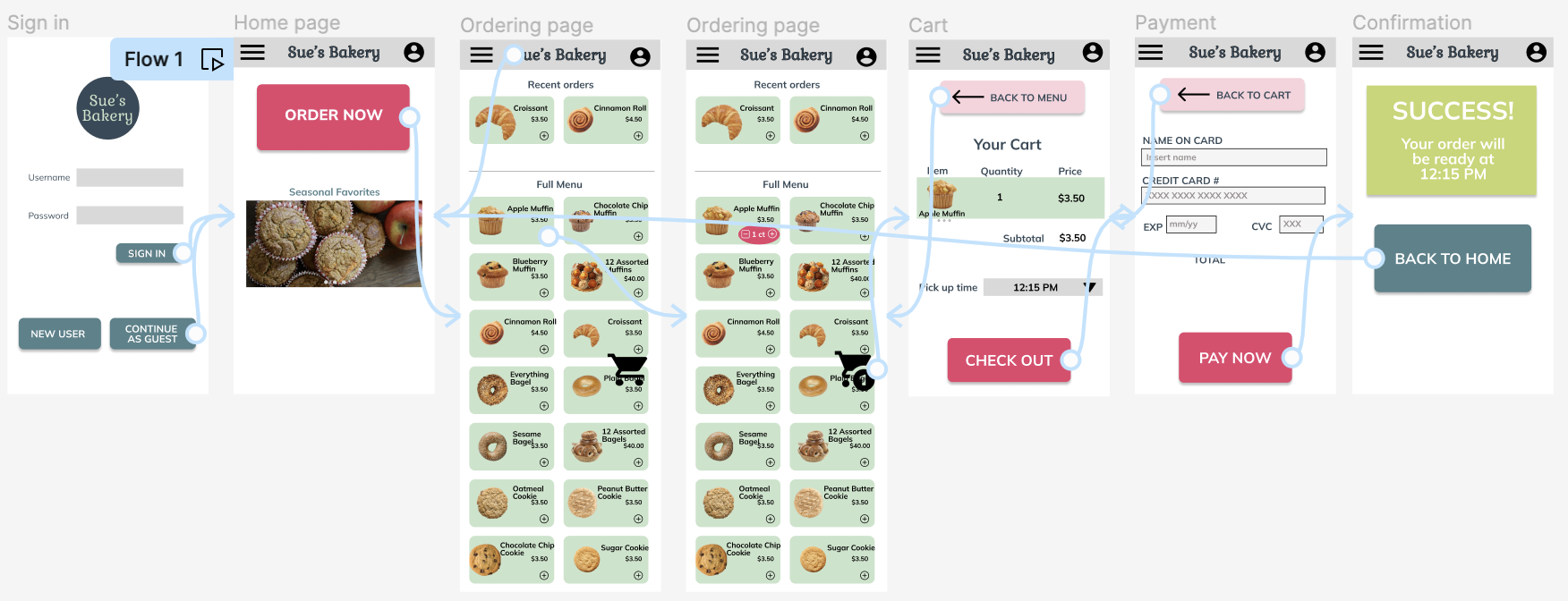
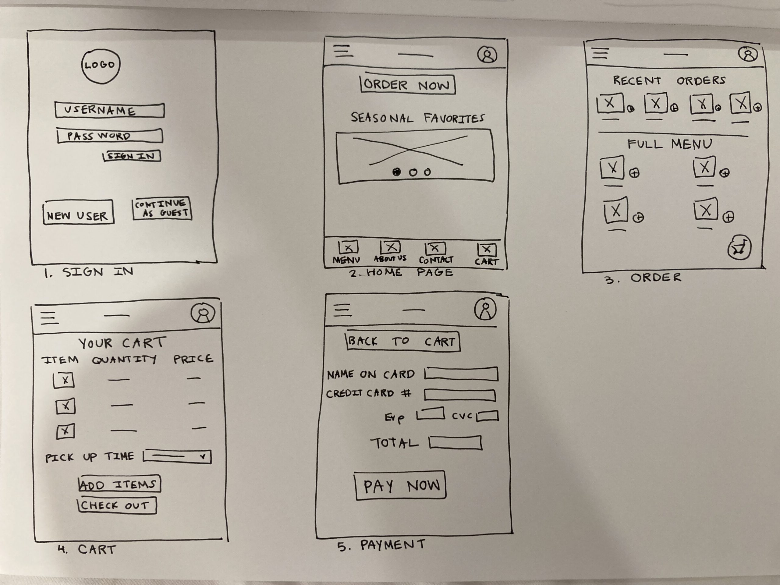
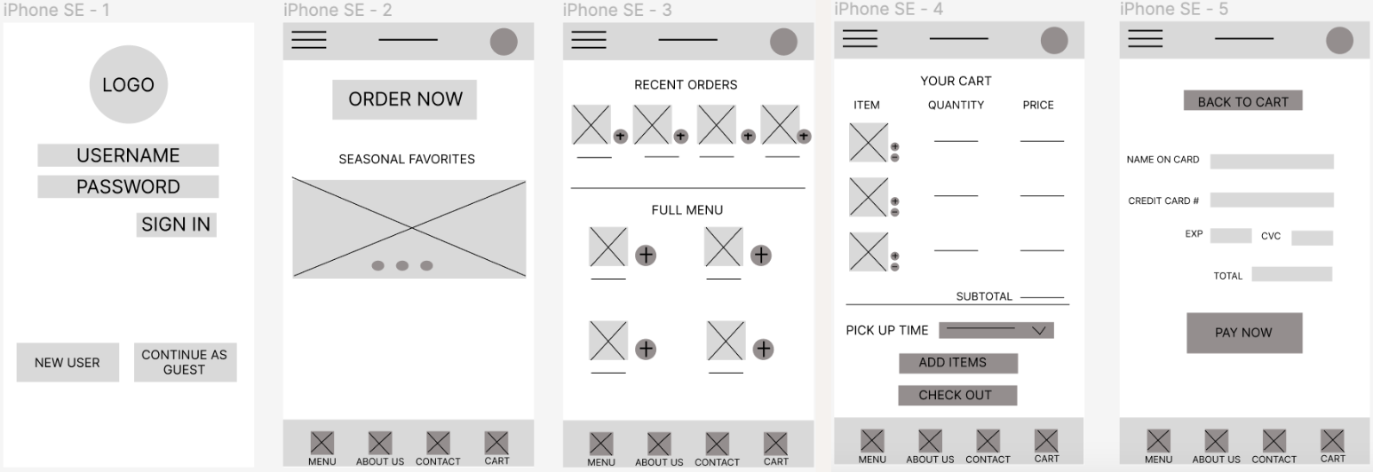
When creating the paper wireframes, I wanted to create a user experience that mimicked other mobile ordering experiences. This way, users won‘t have to lose time navigating a new format. My goal was to let customers complete the order in the least amount of clicks possible. After analyzing the options that I created for each page, I created refined versions of each page. I chose different elements from each iteration, with a focus on eliminating extraneous information. For example, some iterations of the home page focused on the company history or special offerings. Upon reflection, I decided that the “Order Now” button should be the most prominent feature on the page so that customers can place their orders quickly.
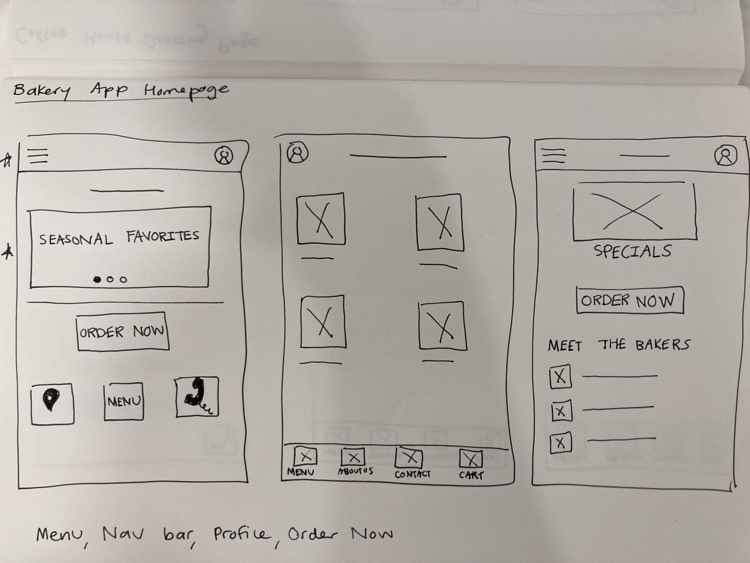
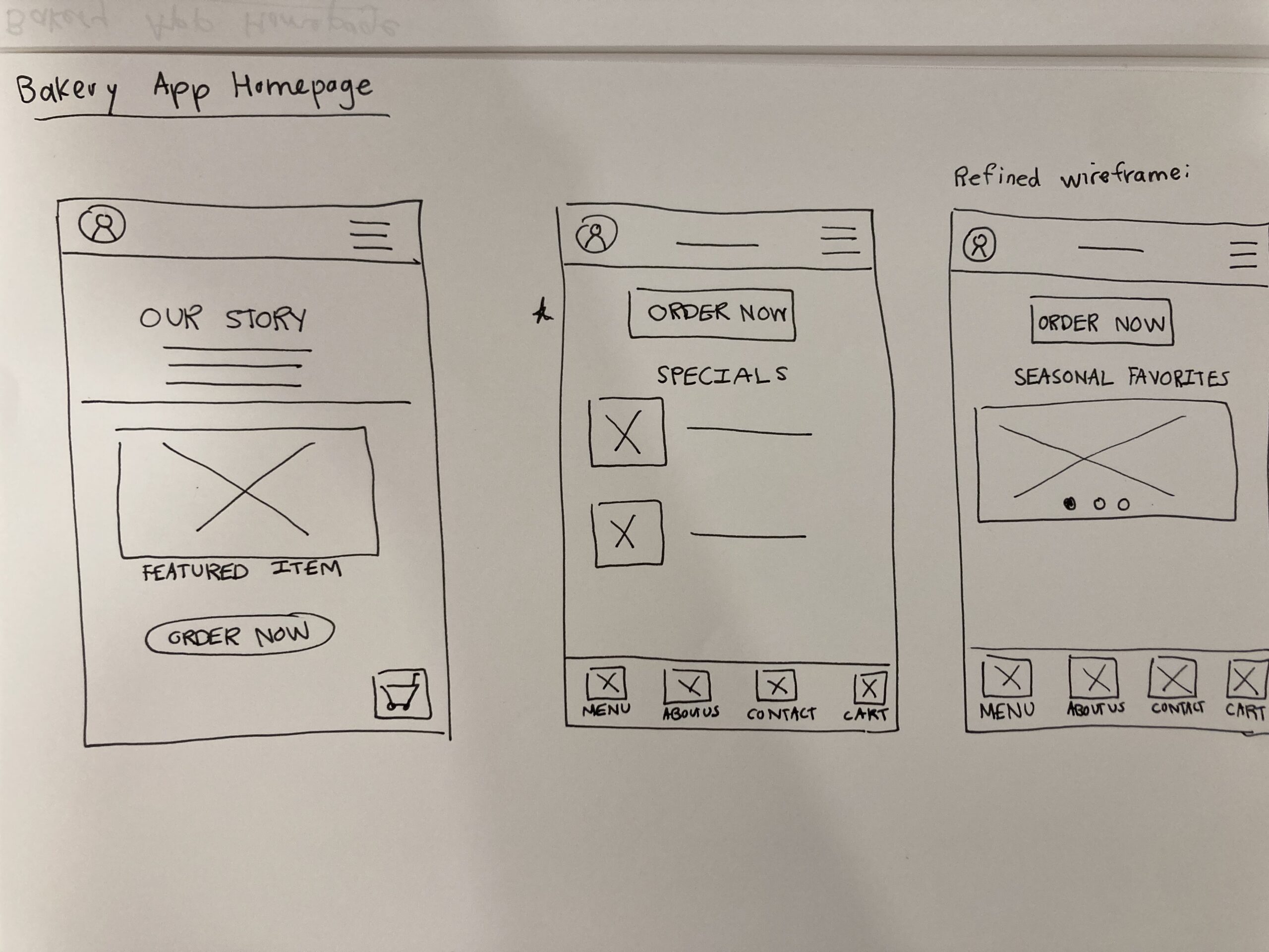
Paper wireframes of user experience
Digital wireframes of user experience
4. Test
Usability Study
I tested the low fidelity wireframes on 5 participants. I iterated on the design to improve the user experience based on feedback.
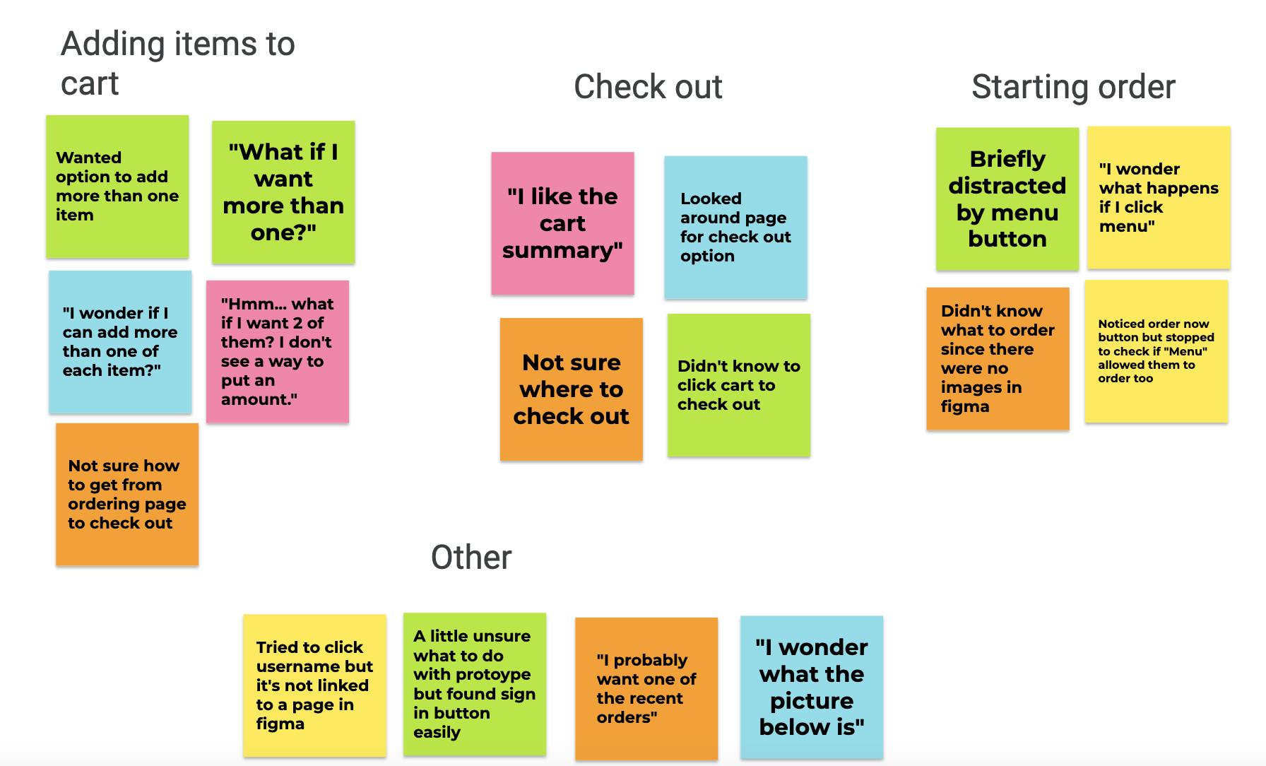
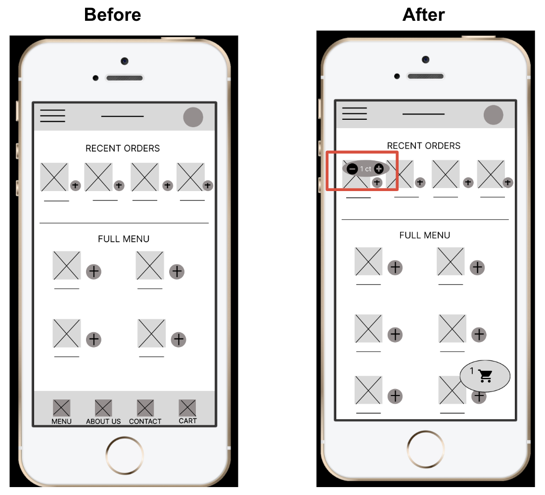
1.It was observed that 4 out of 5 participants wanted a way to add multiples of an item.
I added an item count button that pops up when customers add items to their carts.
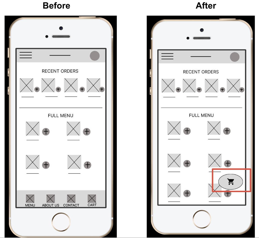
2. It was observed that 3 out of 5 participants did not immediately click the cart icon to begin check out.
I deleted the lower navigation bar. “Menu”, “About Us”, and “Contact” can be added to the hamburger menu in the upper navigation bar.
The cart is now found in a prominent button that is fixed to the screen.
High Fidelity Prototype
I incorporated the feedback from the usability study as I created the high fidelity prototype. The current version has a more intuitive user flow to make ordering fast and simple.
